In May I attended An Event Apart in Boston (AEA). AEA is a 2-day (design) conference for people who working with websites and was created by the father of web design Jeffrey Zeldman and the CSS guru Eric Meyer. The conference has a broad perspective, dealing with everything from how to write CSS3 and HTML5 to content strategy and graphic design. This post is about an AEA topic brought up by Whitney Hess: Create design principles and use them to establish a philosophy for the user experience.
Hess wants to create universal principals for user experience to communicate a shared understanding amongst team members and customers and to create a basis for an objective evaluation. The principles suggested by Hess are listed below along with examples of how these can relate to search and search user interfaces.
Stay out of people’s way
When you do know what people want stay out of their way
Google knows what to do when people visit their search at Google.com. They get out of the way and make it easy to get things done. The point is not to disturb users with information they do not need, including everything from modal popup windows or to many settings.
Create a hierarchy that matches people’s needs
Give crucial elements the greatest prominence
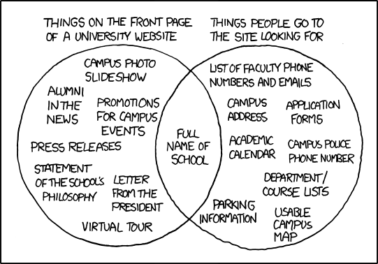
This means that the most used information should be easy to find and use. A classic example is that on most university webpages – it is almost impossible to find contact details to faculty members or campus address but very easy to find a statement of the school philosophy. But the former is probably what users mostly will try to find.
Limit distractions
This principle means that you should design for consecutive tasks and limit related information to the information you know would help the user with her current task. Don’t include related information in a search user interface just because you can if the information does not add value.
Provide strong information scent
There should be enough information in search results for users to decide if results are relevant. In an e-commerce site this would be the difference between selling and not selling. A search result will not be perceived as cluttered if the correct data is shown.
Provide signposts and cues
Always make it clear how to start a new search, how to apply filters and what kind of actions can be applied to specific search results.
Provide context
Let the user know that there are different kinds of search result. Display thumbnails for pictures and videos or show msn availability in people search.
Use constraints appropriately
Prevent errors before they happen. Query suggestion is a good way as it helps users correct spelling error before they happen. This saves time and frustration for the user.
Make actions reversible
Make it obvious how to removes filters or reset other settings.
Provide feedback
Interaction is a conversation so let the user know when something happens or when the search interface fetches new search results. Never let the user guess what happens.
Make a good first impression
You only have one time to make a first impression. It is therefore important to spend time designing the first impression of any interface. Always aim to make the experience for new users better. This could mean voluntary tutorials or fun and good-looking welcome messages.
So now what?
Are universal principles enough? Probably not. Every project and company is different and need their own principles to identify with. Hess ended her presentation with tips on how to create company principles to complement the universal principles. Maybe there will be future blog posts about creating your own design principles.
So what are your company’s principles?
